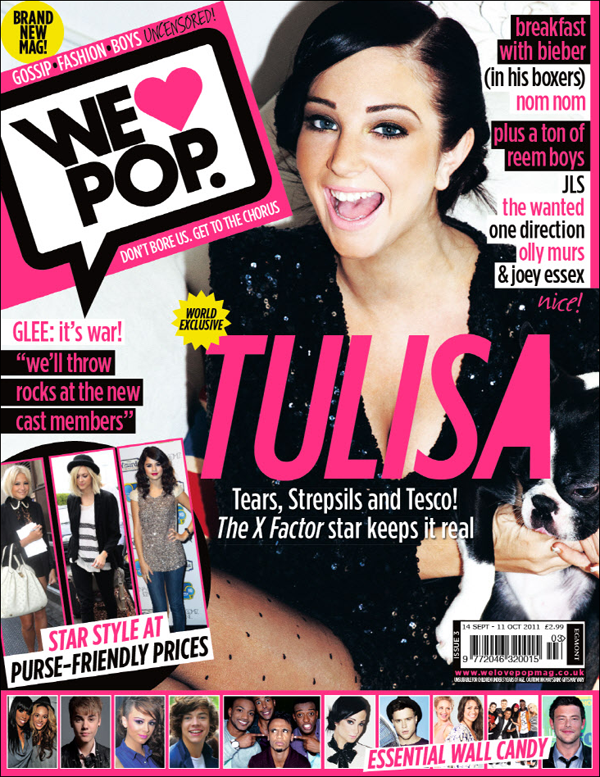
I have now chose which photo to use on my front cover and have started putting it together. I chose this photo because I think it is quite strong and will stand out on the page. Also she looks like she has a bit of attitude and has a bit of an edgy side but she is still quite cool and likeable.
I wasn't too keen on the lighting in the photo though, so I edited it and made it brighter so the colour of her tights and on the bass guitar really stand out. I also cropped it and cut the background out, before cutting the floor out too so I had her on just a plain white background which I've found is quite common on magazines as it puts all the focus on the photo which is what I want.
 I then started placing the plugs around the photo, carefully as to not draw too much attention away from it. I decided on the font for my masthead as I found it complemented the theme of the magazine, and matched it to the girl's tights which are of the colour purple. I placed the name of my magazine across the top of my front cover as that way it is the first thing people will read when they see it, and it makes it obvious that it is the name of the magazine. Below it there is a tagline which reads 'A different take on music.' this sums up the magazine in a sentence, makes it clear what it's about and reinforces the fact that it's a music magazine. The font of this is black and bold so it is noticable as a tagline, but not so bold that it steals focus from the masthead.
The main plug 'CASSIDY WILDE' is in upper case and in larger size copy than the other plugs as well as being the same colour as the masthead. These features show the importance of the plug and make it the main selling point of the magazine. Below it is carried on with a quote from her " I'm more than just your average rock star" this is not in upper case as I feel this would overpower the page and be too much. I still feel the plug does it's job though and entices the buyer to read inside and find out why.

 There are smaller plugs positioned around the photo also trying to entice the target audience to buy the magazine and want to look inside. 'COLDPLAY MYLO XYLOTO' is in upper case to catch the reader's eye and then the rest of the plug is below in lower case as not to take too much attention away from the first line of the plug as it is just adding a little extra information onto it. The plug is more specifically aimed at fans of Coldplay as they would know that 'MYLO XYLOTO' is the name of their latest album. Whilst other readers may not know this but still perhaps be intrigued to read inside and find out what it does mean. There are similar style plugs down the right hand side of the page. There's a quote from Ed Sheeran and his name below in upper case, blue font to complement the colour scheme. This style of plug is quite common in magazines and also quite effective. I looked at a few magazine front covers and found that they looked quite busy with lots of plugs around the main photo, this is the format I have tried to follow with my magazine. The plug 'THE SCRIPT on their massive world tour' has the name of the band written in black bold upper case letters, to draw attention to it, whilst the additional information is in lower case. I feel that if you saw a band's name on the front of a magazine that you liked, you would pick it up to have a read either way to find out what it features. Therefore the text written in lower case is not as important but still needs to be there as not all readers will do this. There is also another plug 'KATY PERRY and the meaning behind her new single' fans of Katy Perry would know what her new single was and be interested to know where it came from. Again the most important part of the plug, the artist's name, Katy Perry is written in larger upper case letters in purple for the same reason why the other plugs are done in similar ways. By featuring plugs of certain artists and having them say things that only someone who liked the artist would understand is a clever way of attracting my target audience.
 Another very important plug on my front cover is the black circle shape which has inside it ' FREE DOWNLOAD' in white font. This font is different to the other fonts on the page which are all the same, other than the masthead and the web adress. This makes it stand out more, as well as it being in a black circle which makes it stand out massively on the page. This is because I wanted to emphasise the plug as I think a free download is a big selling point of the magazine so showing it in this way highlights its importance as well as making it more eyecatching and noticable. The word 'free' is even typed in a larger font than the 'download' this emphasises even more that it's free and to get the target audience to buy the magazine and read inside to find out how to get the download. The format of a plug in a circular shape has also been seen in magazines before and is an effective way of attracting attention to a specific plug.
 For the final plugs there is a rather large + sign in the bottom left hand corner, this is supposed to link to the bar on the bottom which features more plugs, as if to say 'plus all these bands too'. I decided to use the plus sign as I had seen it used on a few other magazines such a Q and I liked the effect it had. The bar along the bottom of the page is also another common method of showcasing plugs. Mine is black with white font to make it stand out, with the names of different bands and music artists that feature inside the magazine. These are in the same font as most of the other plugs on the page to ensure that although they are in a seperate bar, they are not seperated from the magazine and there is still a link. There is also a link with the colour scheme which still follows the same colours, with a dot in the same colour blue as used before on the cover seperating the different artists to show they are all individual artists and it is not one long word. This avoids any confusion and again I feel entices the target audience to look inside and find out what there is to read about the artists that they like.
  Finally I have placed a copyright free barcode in the bottom right hand corner as I feel it fits in well here and gets noticed without stealing focus from any other features on the front cover. Alongside the barcode I have put the magazine's issue number and price so that the target audience can tell how much it is. I priced my magazine at £2.60 as I feel this is an approriate prize for a magazine like this and after asking a few of my target audience they agreed that it was worth that and they would happily pay that price. I have also put the web address for the magazine's website next to the barcode so that if the readers want any more information they can see that there is a website they can go on to get this. It is written in the same colour and font as the masthead to show the link between the two and distinguish the fact that it is in fact the website for this magazine.